Sensitivity, Specificity and All That
Understanding measures of diagnostic test performance
In medical testing, there are many ways to talk about how "good" a test is. There is a lot of talk about sensitivity and specificity, but also accuracy, positive predictive value, negative predictive value, likelihood ratios, and odds ratios. Related concepts include prevalence, pretest probability, and posttest probability. I’ve sat through hundreds of PowerPoint presentations where sometimes one term would be emphasized, and sometimes another.
Naturally, I found all this confusing. I realized that I needed to try to conceptualize the situation better somehow.
Eventually I invented a diagram that incorporates many of these concepts and shows their interconnections. I called this the two by two diagram. It is a graphical representation of the two by two table, sometimes called a truth table:
The diagram starts with a Cartesian coordinate system on a plane, where normality is represented by the horizontal direction, and abnormality is represented by the vertical direction. Superimposed on this plane is a box in which the horizontal dimension represents healthy patients, and the vertical dimension represents diseased patients. You should imagine that this box can slide around on the plane, but must always contain the origin of the coordinate system. The idea is that the test determines where the box falls. That is, the test is done on a suitably large number of patients (normal and abnormal) and the results (positive or negative) tabulated. Then the box can be drawn in the correct position.
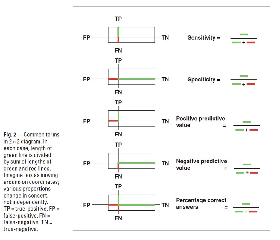
Terms listed in my opening paragraph can be understood graphically on this one diagram:
As the box moves higher, the sensitivity increases. As the box moves to the right, the specificity increases. For a perfect test, the box would lie completely in the right upper quadrant – 100% sensitive and 100% specific. Correct results are represented by the right upper quadrant (true positive and true negative results) and incorrect results by the left lower quadrant (false negative and false positive results).
If you have two different tests, you can plot them both on the same diagram to compare them:
I made the diagram simply to think about sensitivity and specificity but then found it helped me think about other aspects of diagnostic tests in a more organized, connected way. More concepts can be understood and illustrated by it, such as Baye’s theorem, likelihood ratios and others. These are discussed in my papers, linked below.
A simple graphing app can be found here: https://bkjohnson.shinyapps.io/truth/
References:
(With a small erratum here: https://www.researchgate.net/publication/325457227_Erratum_to_Using_Bayes'_rule_in_diagnostic_testing_a_graphical_explanation)
https://www.researchgate.net/publication/12773609_The_two_by_two_diagram_a_graphical_truth_table


